

I led the design and development of Momentum AI's core product post-pivot, creating intuitive user experience prototypes in Figma and ensuring alignment with user-centric design principles.
I spearheaded the product’s full rebrand, including the development of a new branding kit, product vision, and core UI elements.
Additionally, I managed the product development cycle, overseeing feature scoping, scheduling, design reviews, and iterative improvements.
Momentum AI is an advanced no-code automation platform that leverages cutting-edge AI technologies to streamline and optimize complex business processes. By integrating natural language processing (NLP) and computer vision, the platform is capable of recognizing and interacting with graphical user interfaces (GUIs) and digital documents, replicating human interactions with software systems. Unlike traditional robotic process automation (RPA), which is often brittle and reliant on hardcoded scripts, Momentum's AI-RPA approach dynamically adapts to changes in software environments by interpreting visual and contextual cues. This flexibility enables the platform to bypass the need for API integrations, making it particularly effective with legacy systems that do not provide modern API connectors.
While initially focused on automating real estate compliance workflows, Momentum AI’s architecture is highly versatile, supporting a wide array of business processes across industries. Users can construct sophisticated workflows by providing natural language instructions, which the AI interprets and executes, allowing non-technical personnel to create complex automations with ease. By abstracting technical complexity and delivering robust automation capabilities, Momentum AI empowers organizations to enhance operational efficiency, reduce manual labor, and seamlessly adapt to evolving software ecosystems without the constraints of traditional automation tools.

Real estate brokerages were struggling with expensive and complex compliance processes, often relying on third-party teams. These teams, usually business process outsourcing (BPO) firms with contractors working overseas, were costly, had low accuracy rates, and offered little oversight into the process. Additionally, the reliance on outdated legacy software that lacked API connectors made the management of documents cumbersome and manual, further complicating their workflow.
To build a highly adaptable, AI-driven automation platform that allows users to define and execute business processes through natural language. The platform needed to overcome the limitations of traditional RPA tools by eliminating dependencies on APIs and enabling dynamic interactions with legacy software environments.
Through our interviews and collaboration with industry partners, we discovered that real estate brokerages heavily depended on outsourced compliance processing teams, which introduced high costs, inefficiency, and error-prone workflows. The lack of API integrations in legacy software systems further exacerbated the challenge, requiring manual uploads and interaction between disparate systems. These processes were cumbersome and inefficient, leading to significant delays and compliance risks.
Our competitive analysis highlighted limitations in existing automation solutions:

Opportunity Identified:
We identified a gap for a solution to provide flexibility, ease of use, and adaptability to complex workflows while maintaining cost-efficiency. Momentum AI filled this niche, enabling non-technical users to automate sophisticated processes without the need for API integrations or extensive technical skills.
As Momentum AI evolved, managing its development required a structured yet adaptable framework. To meet this need, we established a centralized workflow using Notion, which became the cornerstone of our planning, task management, and feedback cycles.
The Product Roadmap in Notion served as the blueprint for our development. Features were meticulously scoped, prioritized, and tracked to align directly with user needs. This roadmap was a dynamic document that evolved with the project, ensuring that every iteration focused on solving the most pressing problems.

We created a Gantt chart timeline view within the product and engineering feature roadmap. This visualization allowed us to track development milestones, manage deadlines, and assess bandwidth constraints effectively. By providing a clear picture of overlapping priorities, the timeline helped us anticipate challenges and adjust plans proactively to meet project goals.

To complement the roadmap, we used Task Boards to visually map the development cycle. These boards tracked tasks across teams offering a transparent view of progress at every stage. With columns representing statuses like “Not Started,” “In Progress,” and “Done,” the boards made it easy to identify bottlenecks and keep workflows moving smoothly.

This system was essential in ensuring that each team member understood their role within the larger development effort. It also fostered collaboration by making dependencies and timelines clear to all contributors.
The UI/UX Feedback Tracking system was the backbone of our iterative design process. Every piece of stakeholder input, user feedback, and internal testing insight was logged and categorized in Notion. This centralized tracking ensured no detail was overlooked and allowed us to iteratively refine features based on real-world usage.

One example involved the edge port locations in the automation blocks. The implementation did not match designs. By logging this feedback, adding detailed description on addressing the issue, and creating associated tasks, we created a streamlined workflow for hill climbing on implemented product improvements.

Annotated screenshots and screen recorded Loom videos assisted in clarifying feedback and desired implementation. This structured approach not only streamlined our development process but also ensured that every iteration brought us closer to creating a product that users found both powerful and accessible.
Defining Momentum’s brand identity was a critical component of establishing the platform’s presence and communicating its values. I created a comprehensive brand guidelines document that outlined key visual elements, including:


The branding guidelines directly informed the Figma component library, ensuring consistency across all aspects of the product's design. Each design element—from buttons and modals to tooltips and icons—adhered to the established visual identity. Key aspects included:
The branding guidelines shaped the foundational Figma component library, which supported the first iteration of Momentum's platform. This library enabled flexibility and consistency across the complex, DAG(Directed Acyclic Graph)-based workflow canvas. As the product evolved, the component library was refined for the streamlined Momentum Canvas 2.0, focusing on simplicity and usability. Rooted in the original design foundation, the updated library incorporated user feedback to better meet stakeholder needs while maintaining visual cohesion.

This branding foundation not only streamlined the design process but also enhanced collaboration with engineering teams, ensuring a polished and cohesive product experience.
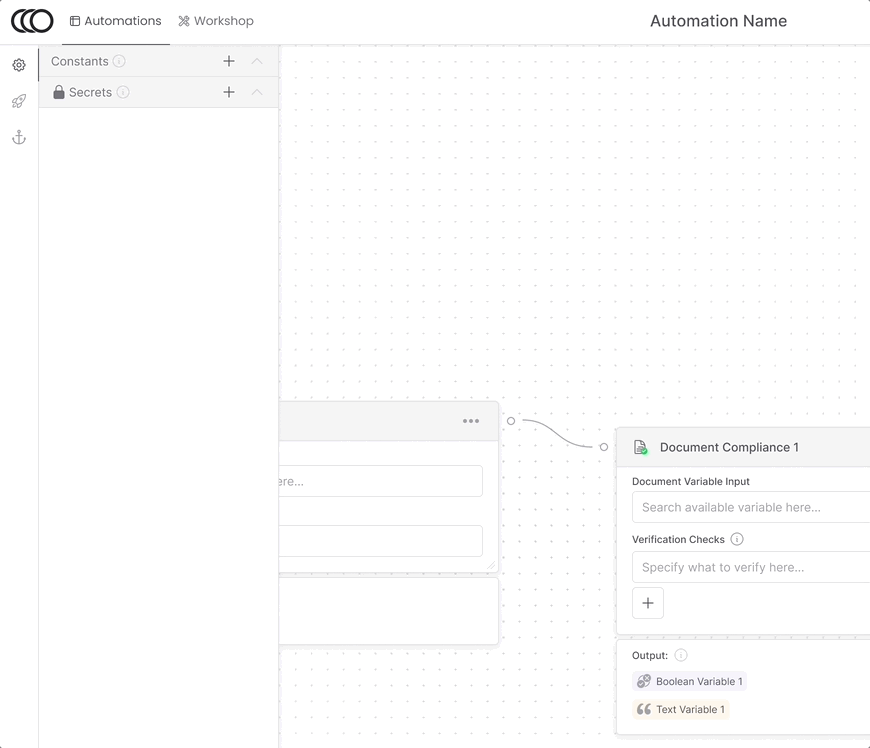
Momentum’s automation platform underwent a significant evolution, guided by iterative design and growing user needs. What began as a simple linear execution model gradually transformed into a sophisticated DAG-based canvas view that could support complex branching logic. This journey exemplifies the power of iterative design, collaboration, and the drive to create a seamless user experience.

The initial wireframe design of Momentum’s automation platform followed a linear, chronological structure to simplify user interaction and reduce complexity. Automations executed in a step-by-step order, defined by blocks arranged in sequence.
On the left side of the interface, users could view the overall structure of their automation, a clear list of steps that outlined the block order. On the right side of the viewport, detailed configurations for the selected block allowed users to define input variables, natural language instructions, and expected output variables. Each block type had a specific function such as retrieving data in a document, performing calculations, or interacting with a browser. A library of block types offered flexibility and function in building workflows.

Users could also view past automation runs to debug issues. Each execution log provided a detailed list of steps, helping users identify errors in their workflows. This approach laid a solid foundation for Momentum’s automation process, offering a clean and intuitive starting point.

As we worked with users, we realized that the linear structure couldn’t support more advanced use cases. Many workflows required branching logic or loops—features that introduced structural and user experience challenges. The linear model became increasingly cumbersome, and its limitations in handling complexity created friction for both users and the engineering team.
This prompted us to rethink the platform. We needed a more flexible way to visualize workflows while ensuring users could still intuitively build and manage automations.

The solution was a two-dimensional canvas view, which reimagined automations as a network of interconnected blocks rather than a single sequence. This shift allowed users to add, edit, and configure blocks in a freeform space, enabling branching logic and providing a clearer visualization of complex workflows.

Key improvements included:

Past automation runs adopted the same canvas structure, ensuring a consistent user experience. When viewing an automation post-execution-run, each block now displayed its execution logs in respective proximity, making debugging more intuitive. Coloring and iconography helped add to highlighting important elements in regard to the execution run.

The transition to a canvas view marked a significant improvement, but our initial implementation faced challenges with screen real estate and navigation. The canvas was constrained by the existing linear layout, leaving insufficient space for large automations.
To address this, we iterated on the viewport design. By slimming down navigation bars and adopting a side panel utilizing iconography, maximizing the canvas area. Tooltips provided clarity for icon functionality, ensuring users could navigate the interface efficiently.
.avif)
A "mini island" system housed in the canvas for additional information such as automation run details(when viewing a run) and actions like saving, in addition to the canvas navigation, further streamlining the interface.

The final design allowed users to focus entirely on their automation workflows, even as they grew to include dozens or potentially hundreds of blocks.
Variables played a central role in Momentum’s automations, connecting blocks and defining workflows. To improve usability:


Blocks were also streamlined to be smaller and more visually cohesive, enabling users to view more blocks simultaneously. These updates enhanced the platform’s clarity and scalability, accommodating workflows of increasing complexity.

Automation often required sensitive information, such as login credentials for interacting with external platforms. To address this, we introduced constants and secrets, which allowed users to define masked variables. These variables were hidden from view during automation configuration but remained accessible for execution.
This feature balanced usability with security, reinforcing user trust in the platform.
The journey from a linear model to a DAG-based canvas view transformed Momentum’s automation platform into a robust, user-friendly tool. By iterating on the design, we created a sleek, intuitive interface that empowered users to build, debug, and scale complex automated workflows.
As part of Momentum AI’s evolution, creating a compelling digital presence was crucial for showcasing the platform’s value. The website served as the face of the company, articulating the product’s capabilities, business vision, and differentiators in a clear and engaging way.
The process began with detailed content and copy planning, structured in Notion. This included the creation of a Website Outline, which defined the key sections, messaging and narrative flow, and definition of graphics. We reviewed and commented within our outline to refine our messaging goals.

As the company evolved, we iterated on this plan, resulting in a Website 2.0 Outline that refined the copy and added new sections to highlight emerging features and value propositions.
The Notion outlines allowed us to plan not just the structure but also the tone and messaging, ensuring alignment with the company's goals and audience needs. The focus was on communicating Momentum's unique AI-powered automation capabilities, the platform's flexibility, and its user-centric design.
Once the content structure was defined, the next step was translating it into visual layouts. Using Figma, I created wireframes to map out the user flow and layout of each page. This stage prioritized usability and clarity, testing different arrangements of copy, visuals, and calls-to-action to guide users effectively through the website.

The wireframes then evolved into high-fidelity designs, incorporating branding elements such as typography, colors, and graphics. Each iteration was informed by internal feedback and testing, ensuring that the designs not only looked polished but also effectively communicated our core messaging.
Building Engaging Visual Assets
A major component of the website's design was the creation of custom visual assets that brought the experience to life. These included:

These assets were designed to make the website more interactive and visually compelling, capturing attention and effectively communicating the platform’s value.
The landing page graphic became a focal point for iteration. Its purpose was to immediately communicate Momentum’s value propositions and engage users within seconds of arriving on the site.
We iterated on different versions of the graphic, each highlighting a unique aspect of the platform:

These iterations were tested for conversion, allowing us to determine which value proposition resonated most with users. This data informed the final version of the landing graphic, which combined sleek visuals with concise, impactful messaging.

Working in the dynamic environment of an early-stage startup required us to stay lightweight and nimble throughout the website design process. Momentum’s goals, messaging, and target audience often evolved rapidly in response to shifting priorities and market insights.
To adapt, we designed the website to be modular and easy to update, ensuring quick pivots as new needs arose. For example, we frequently iterated on messaging, landing graphics, and asset placement to align with evolving product goals or new feedback. This agile approach allowed the website to keep pace with the company’s rapidly changing direction.
The website's final iteration was polished, cohesive, and aligned with the current product vision—but like everything in a fast-moving startup, we knew it wouldn’t stay static for long. With Momentum’s goals continuing to shift, the latest website iteration was simply another step in a cycle of ongoing change, reflecting our need to constantly test, learn, and adapt.
The culmination of these efforts was a product promo video created for the website. Designed to grab attention and provide a compelling overview of Momentum’s capabilities, the video demonstrated the automation platform in action with stylized movement and dynamic transitions. Featuring real workflows and highlighting the platform’s flexibility, the promo video served as both a marketing tool and a reflection of the polished, innovative user experience Momentum aimed to deliver.
This video encapsulated the journey of designing Momentum's website and product, tying together the iterative design process and the company’s vision in a visually engaging format.
Serving as the founding designer for Momentum was a transformative experience, shaping my understanding of product development, iterative design, and the complexities of building an AI-powered business automation platform. The role required ownership over every aspect of design, from crafting the user experience to defining the brand identity and aligning with the company’s vision.
Collaborating with stakeholders was both a challenge and a highlight. Engaging with diverse users, each with unique workflows and needs, demanded empathy, active listening, and iterative problem-solving. Whether adapting the platform for legacy systems or enabling non-technical users to automate complex tasks, every design decision balanced usability with stakeholder priorities.
The dynamic nature of a startup environment tested my adaptability and resilience. Shifting goals, tight deadlines, and rapid pivots meant the design process was rarely linear. Features evolved mid-development based on new insights, and quick decision-making was essential to align with the company’s evolving vision.
Collaboration was key. Partnering with engineers, product managers, and business leads, I learned to navigate trade-offs and communicate design intent effectively. For example, refining the DAG-based canvas required balancing technical constraints with user expectations, resulting in innovative yet practical solutions.
User feedback played a critical role in shaping the platform. Observing interactions with prototypes and analyzing live feedback enabled continuous improvements, ensuring the product stayed user-centric as it grew more complex.
On the branding side, building Momentum’s identity was a parallel journey, combining storytelling with cohesive visual design. From the interface to the website and marketing materials, every touchpoint aimed to convey the platform’s sophistication and human-centered approach.
This experience underscored the importance of adaptability, collaboration, and balancing creativity with practicality. Designing in a startup taught me to embrace ambiguity, prioritize user needs, and iterate toward meaningful solutions—lessons that will continue to shape my approach to design in the future.
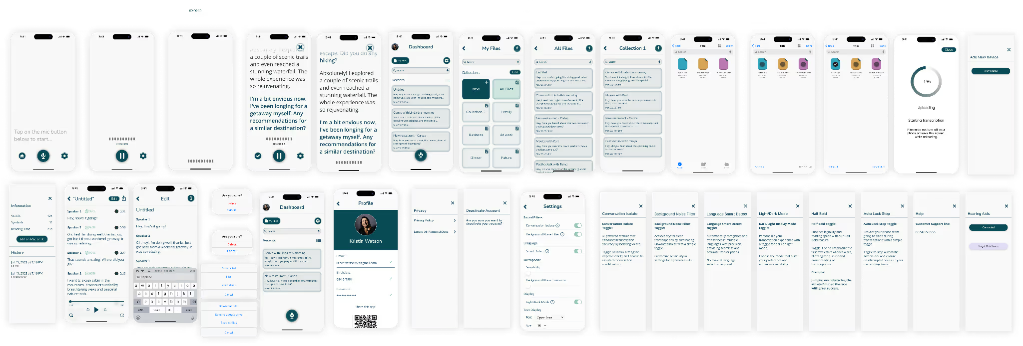
What do individuals with hearing impairments and auditory processing disorders face in their daily lives and how can we come up with solutions that would benefit them?
We created a couple proto-personas as quick target archetypal users to begin our research with.

.avif)
We conducted five 1:1 interviews to understand how a hearing impairment affects people and what struggles they face.
.avif)
We then sorted our interview notes into an affinity diagram: Feelings (missing out, social struggles, worries, pains in public), Actions, Preferences/likes, and Demographics.
.avif)
We identified the following actionable insights:
We also conducted a quantitative survey and received feedback from 27 participants.

We then created our user persona with the insights found through our interviews and survey. She is an amalgamation of all our interviewees, including common traits, goals, and pain points we discovered in our user research.
.avif)
We started brainstorming possible features targeted at addressing goals and pain points of our user persona.

We performed a competitor analysis to gain insights and identify opportunities for delivering a differentiated user experience.
.avif)
In loud social settings with multiple conversations happening simultaneously, it becomes challenging for people, especially those with hearing difficulties, to effectively hear and concentrate on a single conversation.
This often becomes a struggle to actively participate and fully engage with others, leading to frustration and exclusion.
Individuals with hearing difficulties face challenges in social and group environments, impeding their ability to communicate efficiently.
This issue highlights the need for a reliable and user-friendly solution that can effectively address these barriers and empower individuals with hearing difficulties to actively participate and engage in social interactions, ultimately enhancing their communication experience.
We took our features from our brainstorm and worked them into a feature prioritization matrix. We prioritized user needs to enhance the user experience and found we could focus on key features:
.avif)
We then workshopped a storyboard around our user persona, expanding the user narrative to paint a more holistic picture of our desired impact.

We translated our initial ideas into rough sketches, utilizing paper prototyping techniques to quickly explore various design possibilities and gather early feedback on the user experience.

We moved on to translate our sketches into a rough, low-fidelity prototype in Figma.


We conducted usability testing sessions to gather user feedback and identify areas of improvement.
We outlined 4 tasks for our users to perform within the prototype, taking notes of their thought process and tracking the success of user completion. We conducted 5 usability tests where we screen recorded our users while recording audio.
We then analyzed the results to address usability issues and enhance the overall user experience through iterative design improvements.
Some of our highlight notes:
We gathered our notes together and added them to a usability testing matrix, where we could prioritize changes and suggestions found through our testing.
.avif)
We iterated on our low-fidelity prototype with the insights found in our initial testing.

We created a moodboard to capture the desired aesthetic and visual direction for the project.
By curating a collection of images, colors, and other design elements, we established a cohesive visual style that would resonate with the target audience.

We used a style tile to guide the visual design direction of the project.
The style tile served as a foundation for ensuring design consistency and coherence.

We translated our style to our low-fidelity prototype and built a full component system to simulate all user interactions to create our high-fidelity prototype.
We created the full prototype in both light and dark mode to help enhance usability.

To complement the Echo App, we crafted a captivating website landing page.
It served as a crucial touchpoint, showcasing the app's features and benefits while engaging users and driving conversions.
By integrating the website into the project, we ensured a seamless and cohesive user experience across all Echo brand platforms.
%20%20copy.svg)
%20%20(1).svg)
Through user-centered design and cutting-edge technology integration, we have empowered individuals to fully engage in a crucial aspect of life: communication.
By addressing communication challenges through an intuitive and user-friendly approach, the Echo App can make a profound impact for users with hearing impairment.
We are proud of the positive feedback received and remain dedicated to advancing accessibility, embracing user feedback, and continuously improving the app's performance.
Continue user testing and iterative design for mobile:
Conduct ongoing user testing sessions to gather feedback and insights on the mobile experience.
Design the entire website:
Transition from the design phase to focus on creating the visual and interactive elements for the entire website. Pay attention to detail such as typography, color schemes and imagery, to deliver a visually appealing and cohesive website design.
Explore Apple Watch and AR versions:
Assess the feasibility and potential value of extending the product to Apple Watch and augmented reality (AR) platforms.
From the beginning, our work on ShopGPT was shaped by the needs of a major e-commerce retailer partner, whose data and requirements guided our design choices. The partner had a unique challenge: to introduce AI-assisted shopping without overwhelming customers who were accustomed to traditional search. To accommodate this, we explored multiple strategies for integrating ShopGPT, ensuring it complemented existing search methods while creating a distinct, engaging experience.
To meet these goals, we developed several distinct design iterations, each with unique strategies for encouraging users to engage with ShopGPT while providing an option to stick with familiar search methods. These iterations ranged from a minimally invasive iFrame, dual-search UI and to an immersive full-screen assistant, all designed to fulfill the stakeholder’s requirement for a seamless, user-friendly transition to AI-driven shopping.
I had began working with Moda AI with a basics of branding based around their existing logo. This supplied a general direction to expand branding design upon, adding logo variants, color palette, typeface, and other basic pieces.

To keep the AI assistant from blending in, we gave ShopGPT Moda AI’s branding colors and unique visual elements, ensuring it “popped” within the overall site design when appropriate while remaining cohesive with the retailer’s aesthetic. This separation was essential not only to guide users’ attention but also to introduce the AI search as an alternative option without fully replacing familiar features.
With the dual-search UI, we decided on an expandable tab for ShopGPT, keeping it minimized as the initial state. This approach allowed users to engage with the product listing page naturally, without feeling pushed into a new search method. The tab was unobtrusive yet accessible, subtly branded so users could explore it at their own pace. When expanded, the AI search takes up a significant portion of the screen, temporarily pushing down the traditional product listing page and showing distinctiveness with the use of color and branding design.

An alternate version of this dual-search concept presented ShopGPT and traditional search within a single search bar, giving users a toggle to choose between them. This seamless placement allowed users to engage with the AI assistant without leaving their familiar search interface, blending the two approaches for a frictionless experience. Only once the user engages with the AI search does the following results page change to the ShopGPT chat interface.

The iframe overlay, pushed forward as a proof of concept by the stakeholder partner, went through multiple iterations to ensure it felt like an innovative and intuitive alternative to traditional e-commerce shopping.


The iframe overlay was designed as a floating button in the bottom-right corner, following familiar patterns like Intercom. This layout made ShopGPT available at any point during the user’s journey without interrupting their shopping experience. The challenge here was to keep the iframe clean and concise, balancing space constraints with essential functions. Users could navigate through products within the iframe, clicking to view details in the main browser window, allowing them to toggle between traditional browsing and AI-assisted exploration seamlessly.

For more immersive sessions, the full-screen version brought out ShopGPT’s memory capabilities, storing historical searches and saved collections to build a cohesive shopping experience. To make this feel native, we designed these features in line with the host site’s patterns, like side filters and product categories, which users were already familiar with. This approach made ShopGPT feel like an integral part of the shopping experience rather than a disconnected feature.

To illustrate the versatility of ShopGPT’s technology across different platforms, I developed a quick Moda AI website as a showcase for potential channel applications. This site demonstrated how the ShopGPT e-commerce assistant could adapt seamlessly to iframe, mobile, and SMS formats, each using the underlying AI technology to enhance shopping experiences in unique ways.
Built with the adaptability needed in an ever-evolving startup environment, the website was designed to pivot quickly, ready to incorporate new ideas or channels as the product direction shifted. This approach allowed us to effectively communicate ShopGPT’s wide-ranging applicability, reinforcing its potential to reach a broader audience through various channels.
One of the biggest takeaways from this project was learning to work within ever-changing constraints. The retailer partner’s requirements evolved as the project advanced, influenced by shifting perspectives among different stakeholders. Since the ShopGPT integration was experimental, we provided multiple design options, iterating based on feedback and quickly adapting to meet fluid requirements. This agile approach taught me the importance of flexibility in design, especially when partnering with stakeholders who bring their own data, user insights, and evolving expectations to the table.
We interviewed Starting Over's Media and Communications Specialist, Emma Li.
"We want them to learn what starting over can provide for them and what we are about" - Emma
Our Strategy
We created a series of questions for a one-on-one virtual interview with our stakeholder, Emma Li. These questions were designed to help us better understand Starting Over's mission, how they use their website, and what they would like the redesign to focus on.
Our Results
In this interview, we learned that Emma wanted us to focus on making Starting Over's services easily accessible as well as restructure the look and feel of the home and events page to make it more appealing to both donors and people in need of their services.
We performed 5 virtual one-on-one user tests that asked users to perform specific tasks.
During our initial testing we found:
"Categories should be listed in order of importance by whom the non-profit prioritizes most."
"I'm not sold on the Programs page, the text is hard to read with the photo in the background."
We chose this user flow because it highlights the individuals Starting Over aims to support while emphasizing transitional housing as one of the organization's core services.
1. Home Page
Use the navigation menu to find the programs page

2. Programs
Find the transitional housing page

3. Apply for Housing
Find the transitional housing application page

4. Fill Out the Form
Fill out the form provided on the page

During our stakeholder interview we asked if there was any user/website data or user feedback about the website, but Starting Over Inc. unfortunately had not done any sort of user testing or data collecting previously.
Due to a lack of website feedback and website performance data and because we were not able to interview any actual users of the website, we had to redesign based on our collective UI knowledge, guerrilla testing results, and stakeholder needs.
Information Architecture

User Interface
We conducted a heuristic evaluation of the existing Starting Over Inc. website, focusing mainly on our user flow.
Here are some the things we noticed:

We also conducted a heuristics and stylistic competitor analysis of direct and indirect competitor websites.

Starting Over serves two audiences: those who have been recently incarcerated and those who want to volunteer for their cause.


Born & raised in Riverside. High School grad. Previously incarcerated. Looking for a support community and a mentor that can help me start over.
34 yrs old | Male | Single with 1 child
Needs & Goals
Pains & Frustrations
I received my BA in Sociology from UCLA and work as a professor at a Junior College. I spend my free time volunteering with different non-profits in LA.
28 years old | Female | Married
Needs & Goals
Pains & Frustrations
The Starting Over website needs to clarify their site map and navigation so that different audience groups can find the correct opportunities easily and intuitively.
How might we redesign Starting Over to improve content discovery and active engagement by their audience?
To ensure that the website design meets the social needs and solutions that the non-profit provides & to encourage active engagement from their audience.
We wanted to increase visibility into the main website user needs and goals.
The original site map only had drop down menus for 2 primary headers, "About" and "Get involved." We wanted to unhide the company's services by adding a drop down menu for programs and projects.
Card Sorting
We began organizing the websites information architecture by writing down all the possible navigation links on the main page in stickies.

Then we reorganized the topics into logical groupings that fell under the main navigation menu and the footer.
We added "Past Events" and "Upcoming" to make it more clear to the user what has already happened and what is coming up.
We felt that "Programs" and "Projects" were vague and did not properly communicate to the user what each entails so we opted to switch these groups to "Services" and "Community Projects" respectively. Originally, each of these sub-topics were found on separate pages. We decided to make them readily available within the main navigation menu, along with logically organizing those categories.
Finally, the main CTA is the "Donate" button, which we made highlighted, prominent, and available in additional places throughout the website.
Navigation Menu

Footer

Creating the initial layout in a low-fi prototype was key to fixing the foundational inefficiencies with the existing site.
We standardized the spacing, margins, text-sizing, and grouped elements to create a visual format that would make it easier for users to find and read information as well as take action.

.avif)
.avif)
.avif)
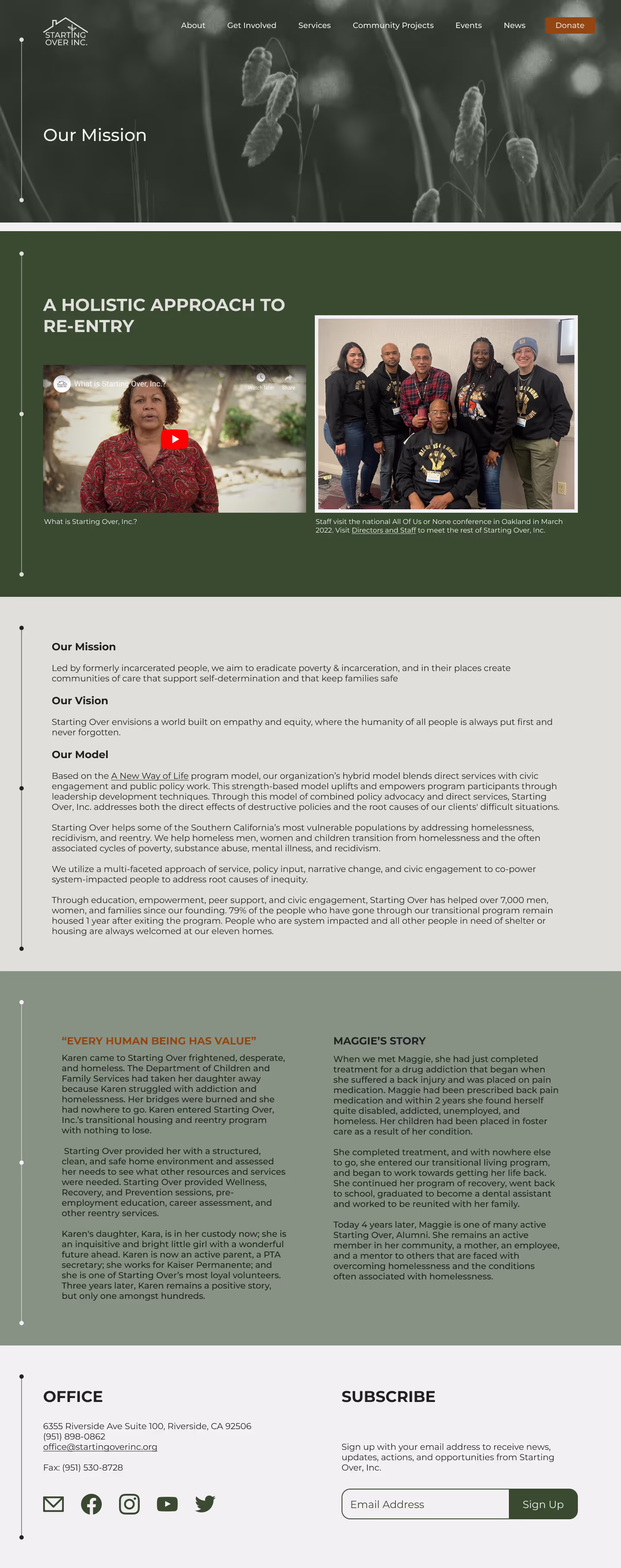
We improved upon Starting Over's website with a logo redesign and a clean aesthetic while staying true to the core theme of "starting over".
We stayed close to the original green palette to promote ideas of growth and trustworthiness but added the burnt orange highlight. We use photography that portrays real people to showcase the type of work starting over does.

Having foundational components built was key for the user to have a successful experience navigating the site.
We began creating a basic set of components based on our now defined style tile to help build out a higher fidelity prototype for consistency and uniformity throughout all designs.

We performed 5 virtual one-on-one user tests that asked users to perform the same tasks as before on our new high-fidelity prototypes for both desktop and mobile.
User Interview Feedback
"The layout is very digestible and it's really easy to understand what is being offered"
- Hi-Fi Interview #1
Through our usability testing, we were able to update our designs for a more intuitive and enjoyable user experience.
Goals
Changes & updates


We original logo felt dated and difficult to identify in some circumstances. So, we decided to update the logo, as well.
Changes & updates

Our updates to the Transitional Housing page helped provide a more personal story with added imagery and testimonials. Additionally, a carousel helped paint a better picture of the service offered here.
Changes & updates
We designed a mobile version of the website as well, including optimized interactions.
Changes & updates


Redesigning the Starting Over, Inc. website underscored the power of aligning design with the needs of stakeholders and user personas to effectively communicate the nonprofit’s mission.
Accessibility testing not only improved usability but also enhanced visual appeal, ensuring the site was both inviting and inclusive. This project reinforced the impact of fine-tuned details—from content hierarchy to color choices—each element serving a unique UX purpose. The iterative process, coupled with feedback from user testing, allowed us to continually refine and elevate the design, with each phase bringing valuable insights that shaped the final product.
Overall, this redesign reaffirmed how intentional, user-centered design can empower meaningful change.
Next Steps
Our journey to create Jollymour Wines wasn’t a straightforward path. Starting in 2015, we began working with winemakers, tasting and analyzing wines to refine our ideal profile for a Napa Valley Cabernet Sauvignon. It took several trials, and a couple different winemakers, before we found the talented partner who could help us bring our vision to life. Each vintage was an exercise in patience and learning, with every year presenting new challenges and setbacks that tested our commitment to producing a wine that met our high standards.
Unlike other products, wine provides feedback only once a year—one chance to harvest, process, ferment, and age the grapes to see if we’d achieved the profile we wanted. Our early vintages, from 2015 onward, didn’t reach the quality we were aiming for, pushing us back to the drawing board each year. With each attempt, we made adjustments and refined our approach, but waiting over a year to see results required a steady resolve and a long-term perspective.
The challenges we faced weren’t just about refining the winemaking process. In 2017, the devastating Napa fires brought a new reality: smoke had permeated our grapes, and the vintage was lost to the disaster. Just as we were finding momentum, the COVID-19 pandemic hit in 2020, halting production entirely and further delaying our dream.
Yet we kept moving forward. These hurdles were part of the journey, shaping our understanding of the wine industry and deepening our commitment. Through setbacks, we learned that making wine was about more than just technique; it was a practice in resilience and adaptability.
The Challenges of Being Small Producers in a Powerful Industry
In Napa Valley, where big names often hold sway, we were small players, renting winemaking facilities and purchasing grapes from just a few rows in larger vineyards. The region’s dynamic market meant that the winery we used could be bought out or overhauled by larger players, often beyond our control. With each vintage, we navigated these uncertainties, grounding our process in what we could control—the quality of our grapes, the expertise of our winemaker, and our persistance.
As we honed the taste profile of Jollymour Wines, our design vision took shape around the rich, bold, and deep qualities of a Napa Valley Cabernet Sauvignon—a wine meant to appeal to an older generation with a refined, classic taste. Guided by a marketing and sales plan that defined our target audience, I crafted a brand identity that echoed the sophisticated profile of our wine.
Each design choice was made to reflect this direction, from the label’s typography to the color palette, conveying elegance and depth. The label design focused on minimalism and sophistication, with subtle, refined touches that would resonate with traditional wine connoisseurs. We wanted our bottle to stand proudly on a table, exuding a timeless aesthetic that spoke to our wine’s bold character.
We wanted an elegant cursive script to reflect the sophistication of the wine’s profile. While experimenting with various typefaces, we landed on Milton Two Bold.

I custom-edited the script for the Jollymour logo, ensuring it aligned perfectly with our desired aesthetic.

I explored incorporating floral elements to highlight the importance of grapes and vines but ultimately shed this idea.
The focus shifted to emphasizing the Jollymour name, placing it front and center to stand on its own.

The label design process involved multiple iterations, balancing storytelling and sophistication while aligning with the wine’s bold, rich profile.
We began by exploring textured backgrounds inspired by worn, older paper, setting the tone for a timeless and elegant label.

To reflect the wine as part of a personal library, we developed an “ex libris” concept, representing the label as a page from the vintage’s book.

Details like a dog-eared corner and page numbering were added to signify each bottle’s uniqueness, emphasizing the personal, handcrafted nature of the wine.

While the “ex libris” theme felt unique, we decided it was too literal. We refined the label by balancing elements and removing the book-like details, while retaining the bottle numbering to maintain a special, personal touch for each bottle.

I also experimented with the aesthetic and layout of our back label, abiding by all the legal requirements for a wine label.

We tested different shades for the label’s texture and applied the designs to digital bottle mockups. This step helped visualize how the final product would look and guided further refinements.

Selecting the bottle was another critical step in defining the brand’s physical presence. We chose a tall, hefty bottle with bold shoulders, mirroring the rich, bold depth of the wine. The bottle’s weight and structure ensured it stood out as a statement piece, complementing the wine’s profile.
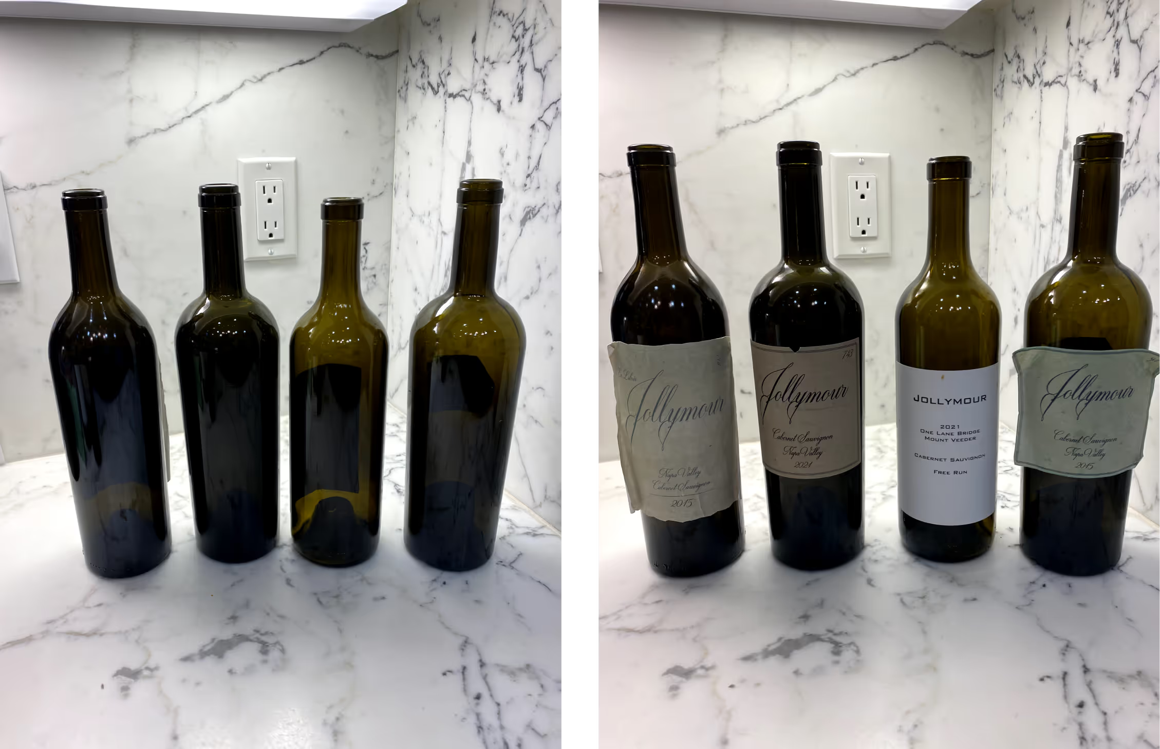
We knew we wanted a black capsule that drew minimal attention away from the main label. Because of the smaller form, the whole "Jollymour" would be too small to read, so we opted for simply the "J" on its own. Subtle, black on black coloring accomplished understated, classy additional branding.

Once the bottle design was finalized, I worked closely with a printing company to select label materials that matched our vision. This involved creating proofs for dyes, embossing, and foil finishes to enhance the label’s tactile and visual appeal. Specific dimensions were tailored to the chosen bottle, incorporating a slight taper for a seamless fit.

The website mirrored this brand philosophy, embracing a dark, rich theme to emphasize the wine’s depth and bold character. Our story, woven throughout the site, took center stage in this journey. With the bottle showcased against a black background, the wine’s presence and elegance were the central focus. The experience conveys the modesty of a family passion project to each visitor, furthering the personal touch of the brand. Through the website, we wanted visitors to feel like they were part of our journey—connected to the heart and care that went into every bottle of Jollymour Wines.
In 2021, our dedication finally paid off with a vintage that captured the profile we’d worked so long to perfect, and we bottled it in 2023 with immense pride. Jollymour Wines stands as a testament to our family’s journey and to the beauty of perseverance. Every bottle represents the years of effort, patience, and passion that went into creating something we could be proud to share—a wine that celebrates life’s special moments with the people we hold dear.
In 2025, we proudly entered our 2021 vintage into the San Francisco Chronicle Wine Competition, where it earned a prestigious Double Gold in its category—a rewarding milestone that reflects the challenges we've overcome and the care we've poured into every step of our journey.


